
The 1% Pattern (a.k.a. The One Weird Trick of Generational Wealth Building)
This same pattern keeps happening over and over again. Can someone, anyone at CNBC or someone at Bloomberg point this out and put this nonsense to bed?

Dear Fellow Traveler:
In 2010, hedge fund manager David Tepper famously said, “You gotta love a put,” referring to the Federal Reserve’s willingness to support markets.
His point?
When the Fed prints money, stocks rise because policy becomes the safety net.
As I’ve said before, it doesn’t matter if it’s Quantitative Easing or some other form of accommodation. So long as the support aims to provide the necessary support to the system, that’s bullish for the equity markets (hello, Bank Term Funding Program).
Fifteen years ago, the Fed and other central banks didn’t have to be as overwhelmingly supportive or provide this “put” against chaos.
The Fed stepped in in 2009, the European Central Bank in 2011, the People’s Bank of China in 2015, and the Fed again in 2018.
All central banks united in 2020 during the COVID-19 pandemic.
It wasn’t happening… every single year.
However, when accommodations were made, the insider buying-to-selling ratio in real dollars surged. Executive insiders called the bottom of every big crisis since 2008.

The pink circles represent significant insider buying-to-selling activity in real dollars those previous financial downturns.
Those extremes stand out in the period before COVID. We haven’t had as pronounced of a period of buying to selling despite the significant downturns of the last few years.
Instead, we see a lot of insider buying spread out over the full year in the post-COVID world. For many, it’s become harder and harder to recognize if spikes in buying are bullish or if they are headfakes that can lead to bigger selloffs (like early 2022).
Why?
We’ve reached a point of terminal velocity, with constant monetary support required to accommodate an ever-fragile global financial system.
The markets have experienced five four-sigma events (or higher) in the last six years (with four events happening in the last four years).
There will be more…
But we can tell you which insider buying moves have been the most significant…
Here at Me and the Money Printer, we’ve noticed something that has evolved time and time again, yet it seems to elude understanding in the financial media…
At a time when the never-ending supportive policy fuels inequality and boosts the wealth of those who own assets (delivering a K-shaped economy), it has also produced a very noticeable and tradable pattern…
It’s what I call… The 1% Pattern.
And if you learn it… You can enjoy the same opportunities as the favored class that is constantly bailed out by never-ending policy support.
It Starts With the Funds
Information is the great equalizer.
And no one has more insight than the hedge funds and other quants that can see behind the curtain when a problem is brewing in the financial system.
As I noted on February 21, our momentum signal turned negative. I explained that this happened on the fifth anniversary of the COVID-19 pandemic's onset.
The momentum equation that we use is pretty simple.
We take all the stocks on the S&P 500 and plot them on a bell curve.
We only focus on stocks breaking out in very specific conditions and subtract the number of stocks in very negative conditions.
That gives us a number.
When it’s positive, money’s flowing into the S&P 500 on the aggregate.
When it’s negative, that’s where the warning flag flies.
After our signals turn red, that’s where we look for confirmation on the FNGD.
As I’ve explained, bad things happen when the FNGD goes above its 20-day and 50-day moving averages.
What ensues in periods of brewing stress—usually missed by the media until AFTER it happens—is that something significant is happening. It’s usually a liquidity event, stress in the bond market, or, in the case of April, a trade creating a liquidity problem.)
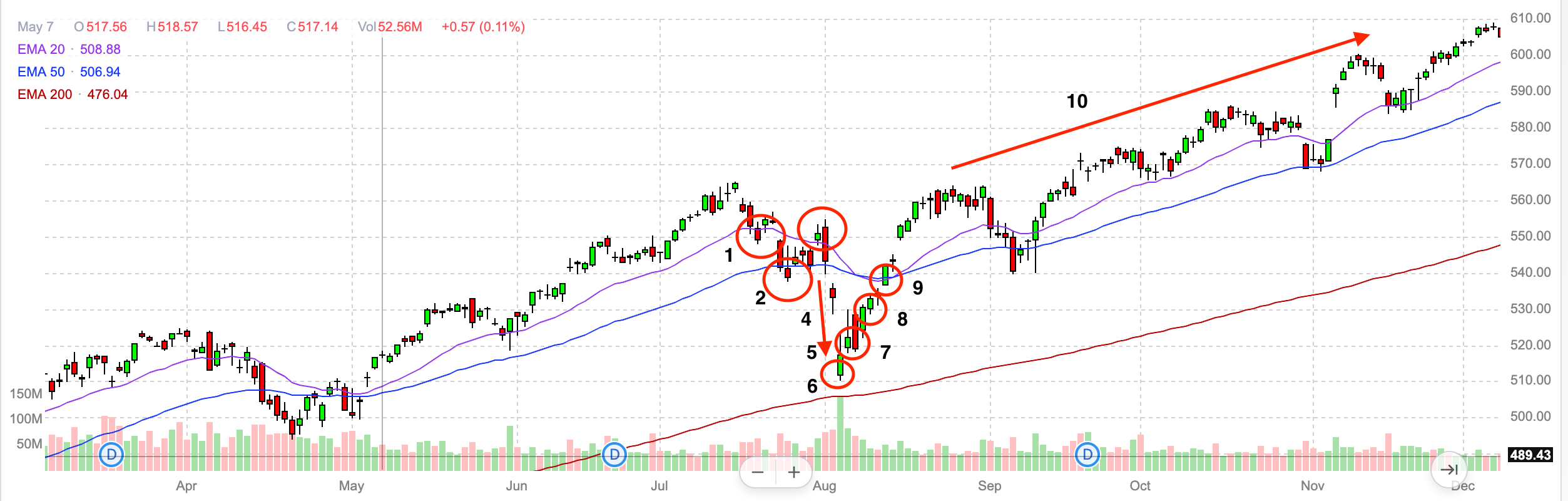
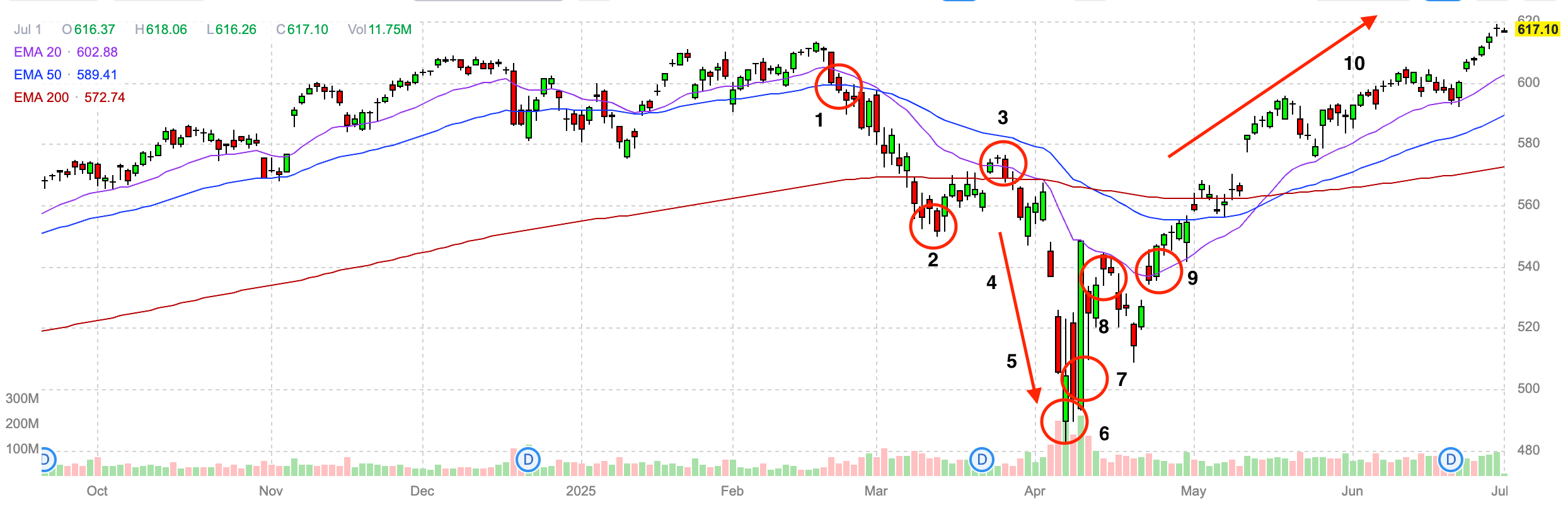
And it follows a simple 10-step pattern from selloff to crash to recovery…
This is the 1% Pattern (AKA The Policy Put).
In mid-February, we warned about a selloff linked to excess liquidity in the system.
What followed was this very specific timeline from selloff to crash to recovery…

After the equation went negative on February 21, we had confirmation on the FNGD on February 24. We also saw the S&P 500 fall under its 20-day and 50-day EMAs.
What happens next is pretty magical… and predictable.
The numbers below outline how the markets react through post-COVID crashes (although there’s evidence of this in large downturns throughout history).
A drop under the 20-day and 50-day EMA…
A period of zero buying pressure (no breakout stocks in the equation) that leads to a short squeeze because sellers have no buyers to sell into in a short window.
A short squeeze move that sucks retail back into the market.
Funds then use that short-term pop to sell back into pressure at a rapid pace.
A dump then leads to panic among retail and institutional investors. People are running around with their hair on fire. Jim Cramer is usually panicking and everyone is talking about the end of the financial system.
Then, we look for an accommodative shift in policy—whether it’s supportive monetary policy (October 2022), a new lending program (March 2023), a subtle shift in forward guidance (Bank of Japan in August 2024), or a change in trade policy (April 2025).
The insiders load up because they know that accommodation is forthcoming (they spend a lot of money on fiscal policy and monetary policy consulting), and as always, the policy accommodates the bond markets.
We start to rebound, and we bounce higher…
Momentum returns to the market… and inflows accelerate… everyone cheers!
The media wonders what the hell happened… or they ignore it and move onto the next news cycle.
Interestingly, upon reviewing other periods in history, I've noticed similar patterns to the selloffs of 1987, 2002, and 2008.
But this has become the go-to reading in the post-COVID World.
Here’s the COVID crash pattern…

Here’s the 2022 GILT Crisis… and the Silicon Valley Banking Crisis…

Here’s the Nikkei Crash in 2024…
And again… here’s the 2025 Trade Crash…
Funny… It’s almost like this is programmed… isn’t it?
No Warnings
You’re going to see what I regularly point to March 2023 as the perfect example of a crash that the media missed.
Specifically, I highlight the fact that in 2023, we experienced a significant selloff that began around February 15, following the S&P 500's drop below its 20- and 50-day moving averages. Look at the patter on the right side of the chart…
What is fascinating about this selloff is that our signal went negative for the second time in two weeks, specifically on March 7… That was the end of the Squeeze and the dump into pressure. Someone knew something…
Because a few days later, Silicon Valley Bank was gone.
There was no warning. There were no media stories warning of a banking crisis.
If you search Google News before March 7, 2023, you will find zero stories warning or worrying about regional bank stability. That’s how fast and furious these events are.
A similar situation occurred in August 2024, during the Nikkei Crash, with only a few bloggers warning about the instability of Japan’s banking system.
I hope you’re seeing what I’m seeing.
It’s a process — almost a boot camp — for anyone watching the macro.
And it’s my assumption that this can and will continue well into the end of the decade.
My advice: look for the pattern, play each stage with conviction, and act like you’re in Venice (instead of Rome), where $37 million weddings are what the Wall Street Journal will focus on instead of how the financial markets really work these days.
Stay positive.
Garrett Baldwin
A reminder, if you need a primer, I did a full video on this pattern and the inputs. I give it away for free… because it will hopefully give retail investors a bit better advantage.
Classic! Recognize the pattern and buy the dip...
Ok